Mailchimp | Wayfinding & Nav
In-App Homepage Redesign
I led the redesign of Mailchimp's in-app homepage, leading to an average of 28% increase in KPI's.
Overview
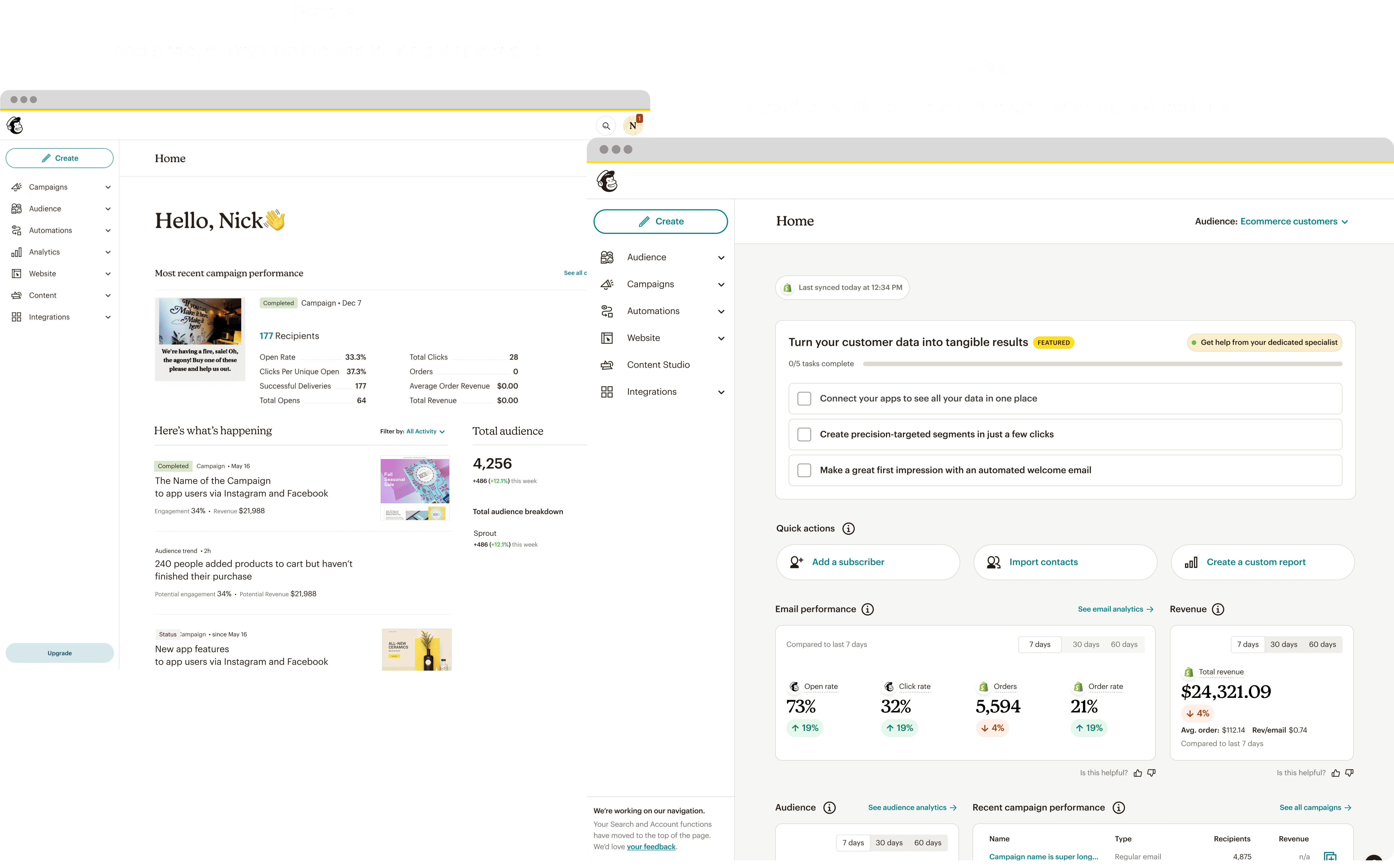
We learned through user feedback that the Mailchimp homepage was not helping our users accomplish the things they wanted to do.
I led the redesign of this homepage in collaboration with many squads and cross functional partners such as data-science, analytics, product, and engineering.
Responsibilities
I was responsible for creating a competitor analysis, identifying a few directions, designing early concepts and rapid prototypes, creating visual style guidelines, figuring out a customer feedback mechanism, and more.
Guidelines
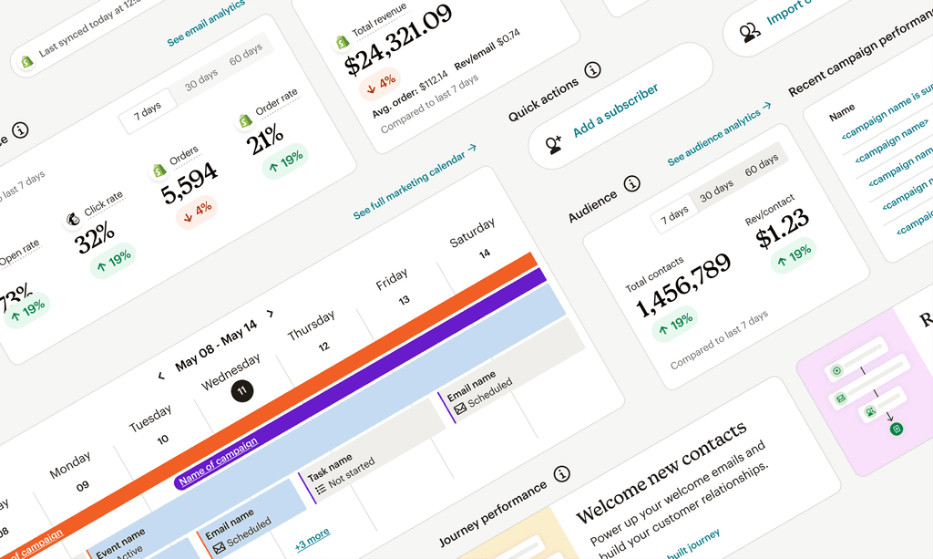
I created guidelines that included a flexible grid, module widths, corner radius, borders & padding, tooltip copy, zero/empty states, etc.
The dashboard style of this new design made it easier for users to see key metrics and take action.


Design system
Mailchimp had a very well-established design system that was in need of a refresh. I used as many existing styles that I could for the sake of speed, but was able to contribute the modules I created back to the system.
The guidelines above combined with the visual styling you see below are examples of how my modules came together for certain information that users wanted to see.
I designed most of the modules for the homepage while taking into account the goals of other squads (like "Audience" for example). The rest were contributed to the homepage by designers on other squads.

Results
In the end, my new homepage design resulted in a 37% increase in first emails created, 33% in automations started, and a 15% increase in imported audience lists. Each KPI is a driver for customer retention.
I had a Slack channel connected to Qualitrics to notify the team and leadership of customer feedback. This was essential for leadership to see/hear celebrations or criticisms from the source.

Nick Cuda
Senior Product Designer

newsletter

Un-Employer